- No products in the cart.

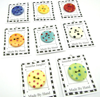
Your store needs a "look". That look encompasses your logo, your sign, your bags, your work, your displays, etc. If you're starting from scratch this is probably a lot to think about. If you are already making jewelry to sell than your work most likely, already has a feel. You'll most likely want to expand on that. My work is bright and whimsical. I always have some lime green, black, and white in it somewhere. I wanted the work to be the focus in the gallery not the walls. I choose to go with a light blue-ish purple for the walls, of course a black and white checkered floor, and lime green accents.

My signage is all black, white, and green as well.

My bags, tissue, and tags are the same too.

See where I am going with this post?

Pick two or three colors and use them consistently. Pick a font and use it again ad again. Get a logo and use it again and again.
Consistency is the key to getting customers to know your work and your style. It also shows that you are stable for a lack of better words. Customers want to know when they come shop with you that they will be able to get the same thing again and again.
Stay tuned for more....
Visit my Website, Etsy Shop, Blog, Facebook, or Studio and Gallery
